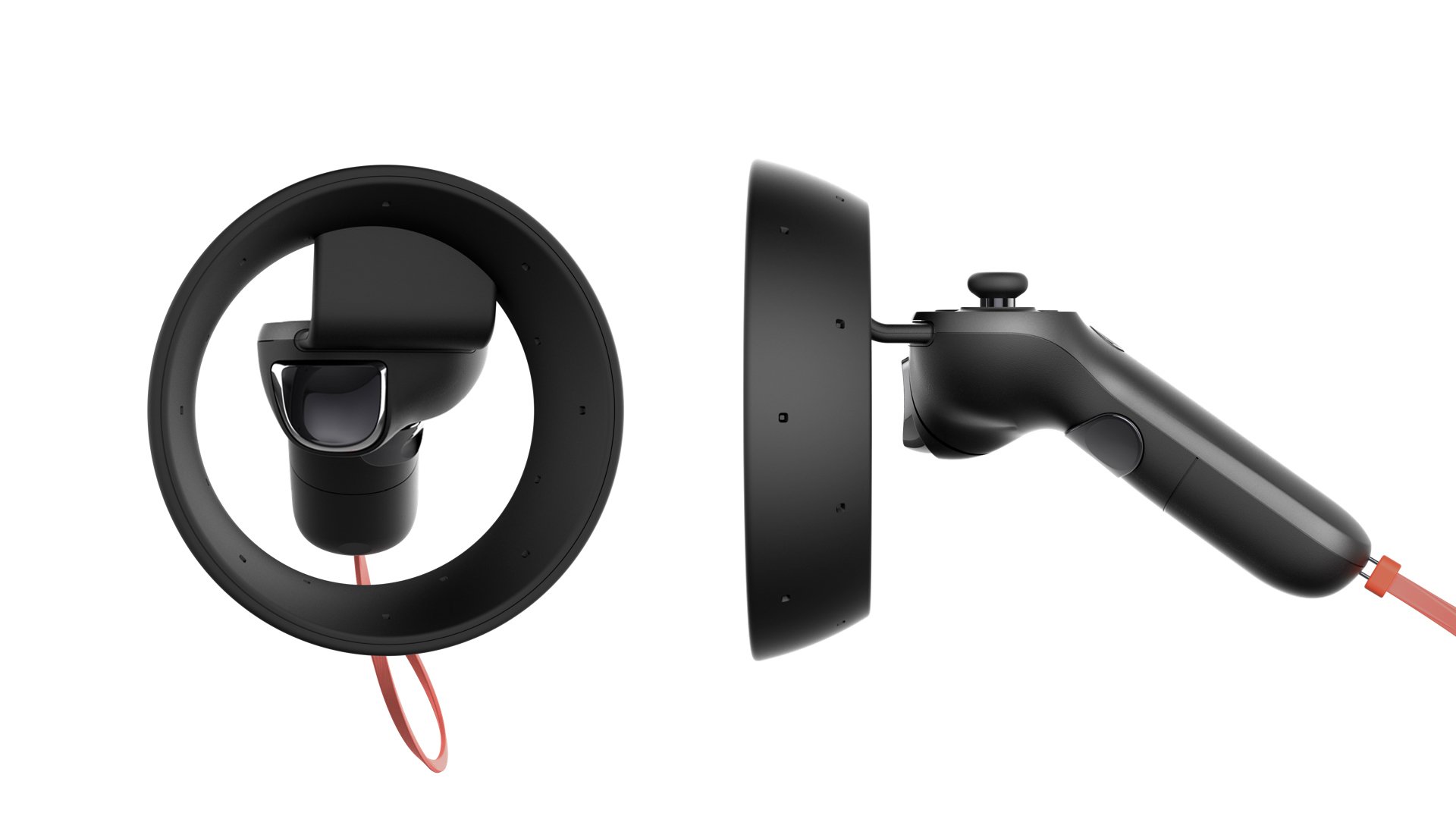

While at TACTILE, I collaborated with MICROSOFT on the design of their new Mixed Reality Controller. This is the first controller to be bundled with MICROSOFT’s new Mixed Reality Headset released in partnership with HP, Lenovo, Dell, Asus, and Acer. Design requirements include a motion tracking ring of LED lights, a thumb stick, D-pad, home and menu buttons, two trigger buttons, and a battery compartment housing 2x AA batteries.
The team consisted of myself and two other industrial designers. Scope of work included: architecture & form explorations, usability & ergonomic studies through quick iterations, rapid prototyping, CMF explorations, and design for manufacturing. Launched on October 2017.

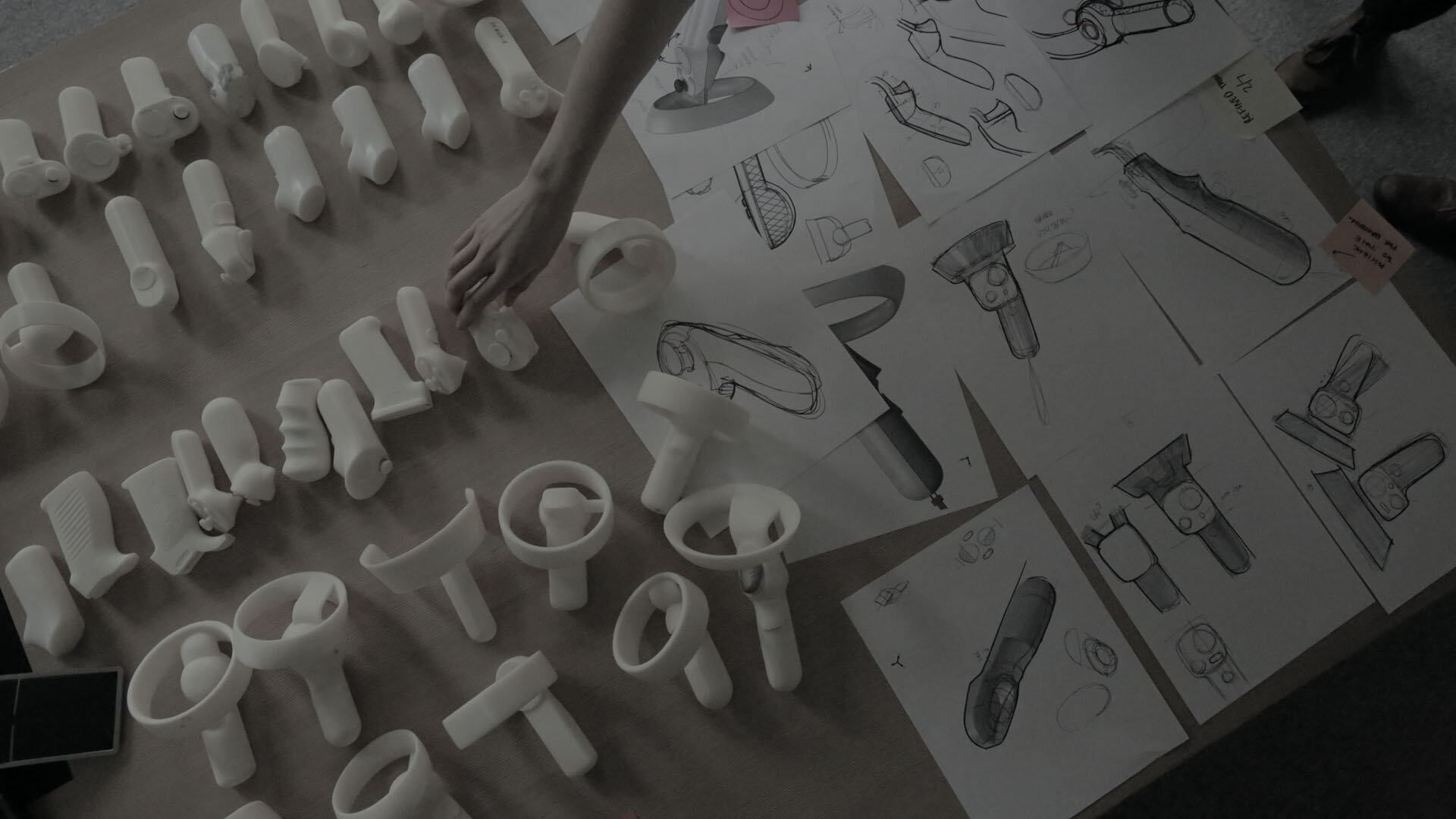
Because of the short timeline, we had to iterate quickly. Instead of starting from scratch, we took what we knew worked. That meant taking aspects of other successful controllers like the Oculus Rift and the Xbox One controllers. Given that this is a hand held gaming device, often used for hours at a time, ergonomics were heavily considered. We made many paper, foam, and 3D printed models, often iterating once, even twice a day. The team constantly iterated making adjustments in millimeter increments at a time to achieve the most desirable outcome.
While we were not able to alter the LED tracking ring, we were able to explore different locations and orientations of the ring in relation to the handle. Very early on, we discovered angling the ring away from the knuckles gave more breathing room for the hand and fingers.
Form Exploration
The size and location of the thumb stick and capacitive touch D-pad were carefully considered. We studied the anatomy and the movement of the thumb to optimize the location of the thumb stick and D-Pad so users can switch between the two without needing to adjust one’s grip. The two controls are spaced far enough apart so the thumb stick will not be accidentally triggered but close enough to allow users to quickly switch between the two. The natural resting position of the thumb lies between the D-Pad and the thumb stick so there is no bias towards either one of the controls. A slight lip was also added to the perimeter of the D-pad so users can feel the limits of the D-pad without needing to look down.
Both the main and secondary trigger buttons were sculpted so kids with smaller hands can easily access them while adults with larger hands can comfortably wrap their fingers around the trigger.
Kids/Small Hands vs. Adult/Large Hands


