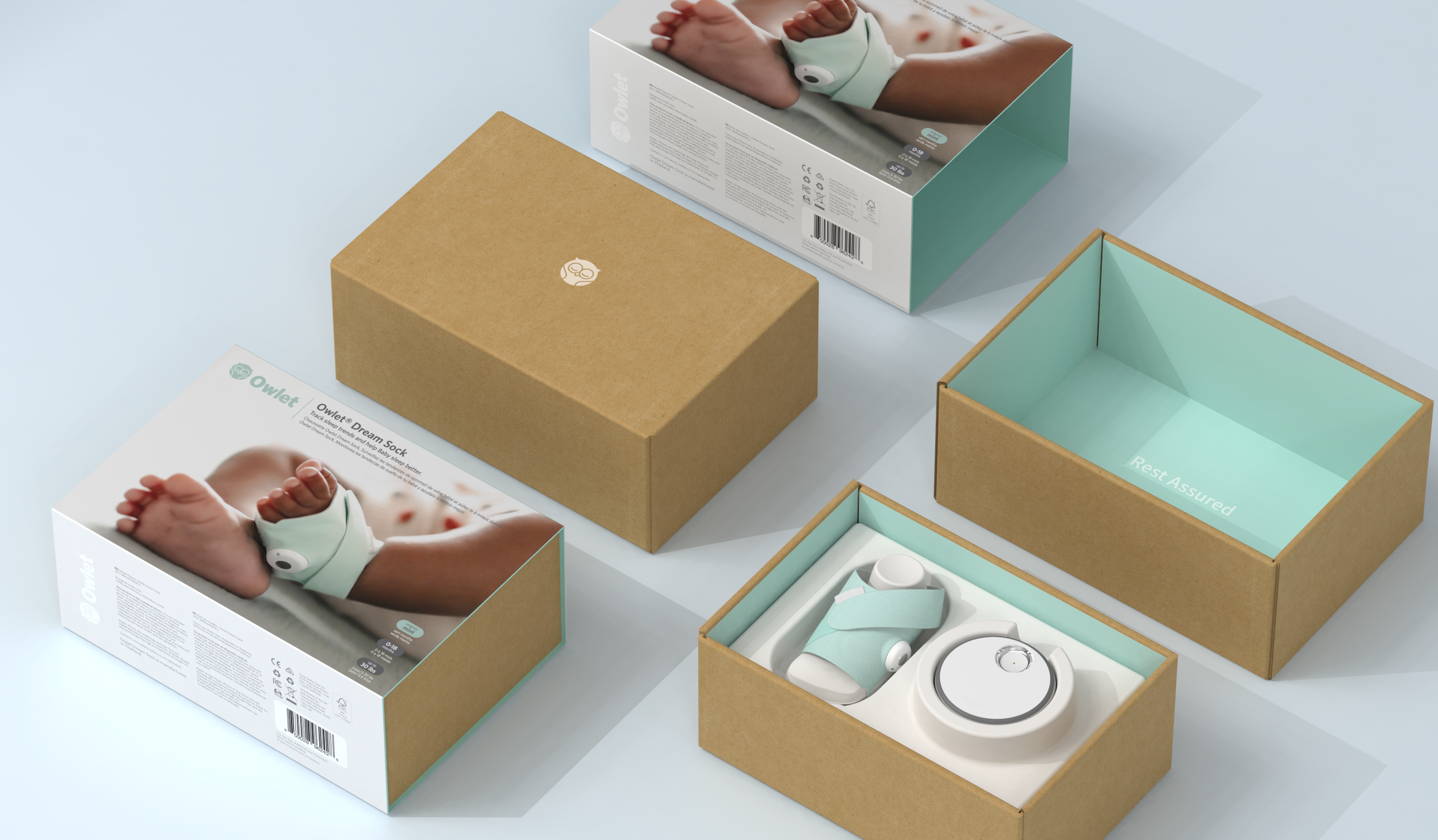
After careful consideration, the team chose the clam shell design for the refresh. Everyone who interacted with the design enjoyed the experience of opening the clam shell box (like opening something special or opening a jewelry box). There is a level of precision and premium-ness to the experience. While we were able to save 20% over the previous packaging design, we wanted to make sure the packaging and the unboxing experience continued to feel premium, especially with the decision to expose natural cardboard material.
The architecture was designed so that the product and its contents are revealed in two stages. First, the sock, sensor, and base station is revealed as the clam shell box is opened. The paper foot not only presents the sock to the user but also educates them on how to properly wrap the sock around their baby’s foot. Then the power adapter, cable, and extra fabric socks are revealed by opening the panel on the top of the clam shell. We made sure this design is adaptable and scalable for sale in other countries (different size power adapters) as well as for other products in Owlet’s ecosystem (like the Cam2 baby monitor).


