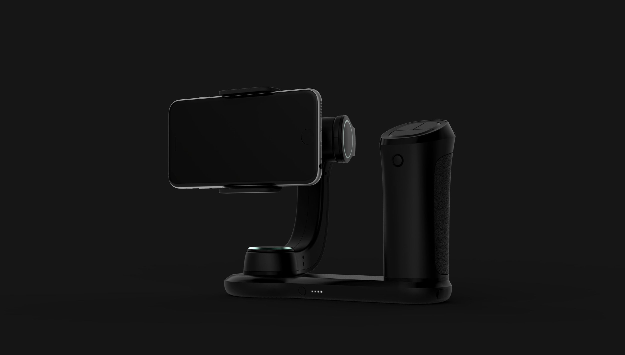
FREEFLY designs, manufactures, and markets camera movement systems and camera stabilizers used in cinematography including unmanned aerial vehicles for aerial cinematography, gimbals, and remote controlled vehicles. The question they proposed was how do we get pro equipment (left) into the hands of everyone who has a smartphone (right)?

Scope of work included: user research, creating user personas, architecture & form explorations, usability & ergonomic studies through quick iterations, rapid prototyping, mechanical engineering, CMF explorations, and design for manufacturing.


As this was a new space FREEFLY was entering (up until now, FREEFLY’s products are sold to professionals that work in the cinematography industry). It was important to define the new users and their needs. Can we develop an UI that is simple and intuitive enough for a mother who just want to capture their child’s soccer game and at the same time satisfy the needs of the amateur or professional videographer?


Working in tandem with the UX team (who were responsible for the on-screen UI), we developed two physical button sets that compliments the on screen UI. We also storyboarded the user experience from unboxing to recording, editing, and sharing. 


Utilizing my mechanical engineering background, I explored different arm locking mechanisms while considering ease of use, intuitiveness, and robustness.


As this product deviates from FREEFLY’s existing group of core users and will also be sold in a different product category, I wanted explore a few different visual brand languages. From the existing FREEFLY design aesthetic which is more engineering driven, form follows function, and true to materials to designs that are more organic, consumer friendly, more approachable and less intimidating.


Previous
Previous

Waterpik Sidekick

Next
Next

Owlet Packaging